JP Windowclean
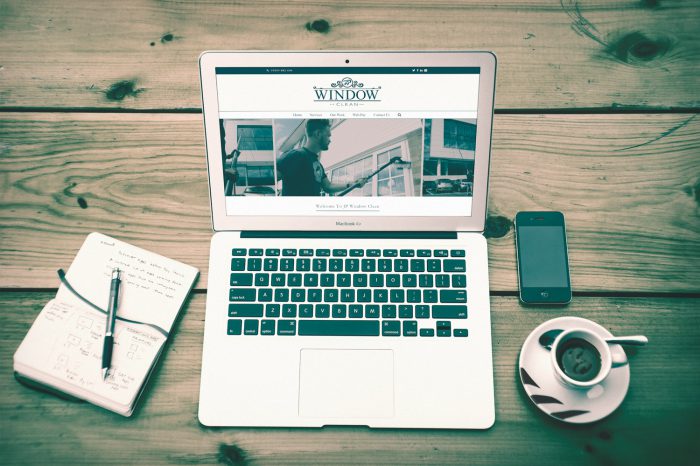
Logo and Website for this window cleaning company in South East London
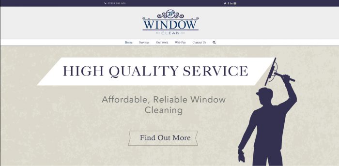
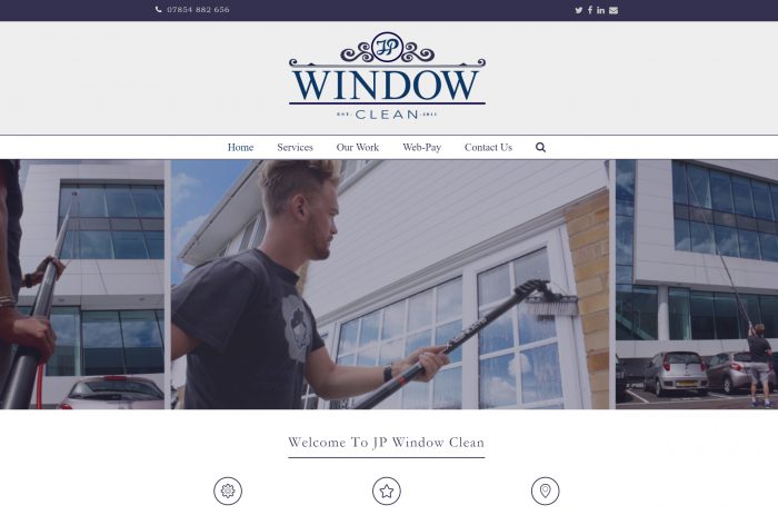
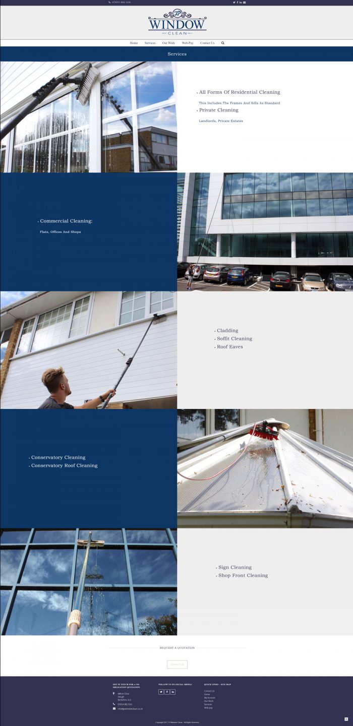
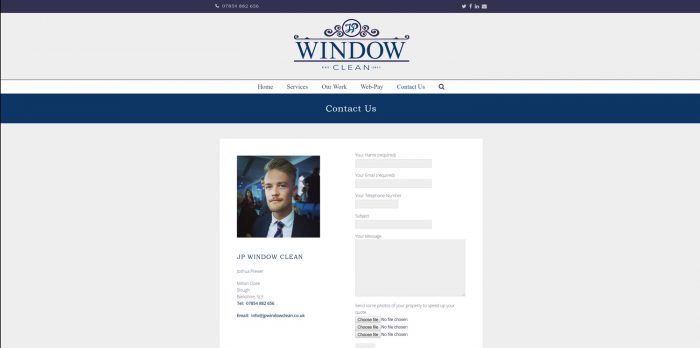
My client wanted a vintage looking logo and vintage looking site, so with our research that we completed in the brief this was the style I provided. My client wanted a mixture of a light cream and two different navy blues in his logo and throughout his site. He had a very specific style in mind. I think the execution of this project was successful because so many window cleaning companies have a very similar style of water droplets, white and blue to depict their style. We came up with a unique and individual style which has brought him success in his business. He wanted a web pay functionality on his website, and we used bespoke photos taken of my client doing his work. A much more personalised look than using stock photos.
I created a logo and social media graphics for my client, as well as built the website on WordPress so my client can edit the website using the built in CMS himself, which most of my clients like to do.
- CLIENT JP Windowclean
- YEAR 2016-2017
- CATEGORY Branding , Web Design
- TAGS


